Theme architecture proven
The exercise demonstrated that a theme can change page architecture and behaviour, not merely palette and decoration.
Our work / Platform · flagship build
A self-imposed platform stress test
The OliveCore platform page explains the product. This is the making of olivecore.net: one structured page, seven genuinely different presentation systems, and a deliberate attempt to discover where our own platform would bend.
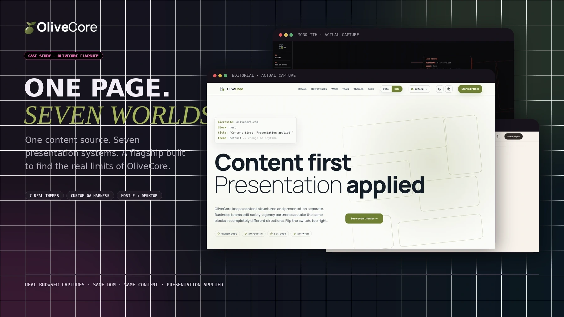
(01) The brief we gave ourselves
Most product demonstrations show the safest route through the product. We chose the opposite. The flagship had to prove that OliveCore could move far beyond a house template without losing the content model, editing discipline or engineering standards underneath.
We asked the same records to support a restrained professional service, a vivid cultural identity, a journal, a terminal-like interface, a gallery-scale Monolith treatment, a structured Charter presentation and a warm service-led Catered For experience.
(02) One source, seven renders
The themes do not carry separate copies of the page. The same blocks, records and words are interpreted by seven different presentation systems. A theme can change the navigation model, section rhythm, type hierarchy, animation and component behaviour without changing what an editor owns.
That distinction is the proof. A colour switcher would have been easy. Seven different ways to understand the same page forced the platform architecture to earn its keep.
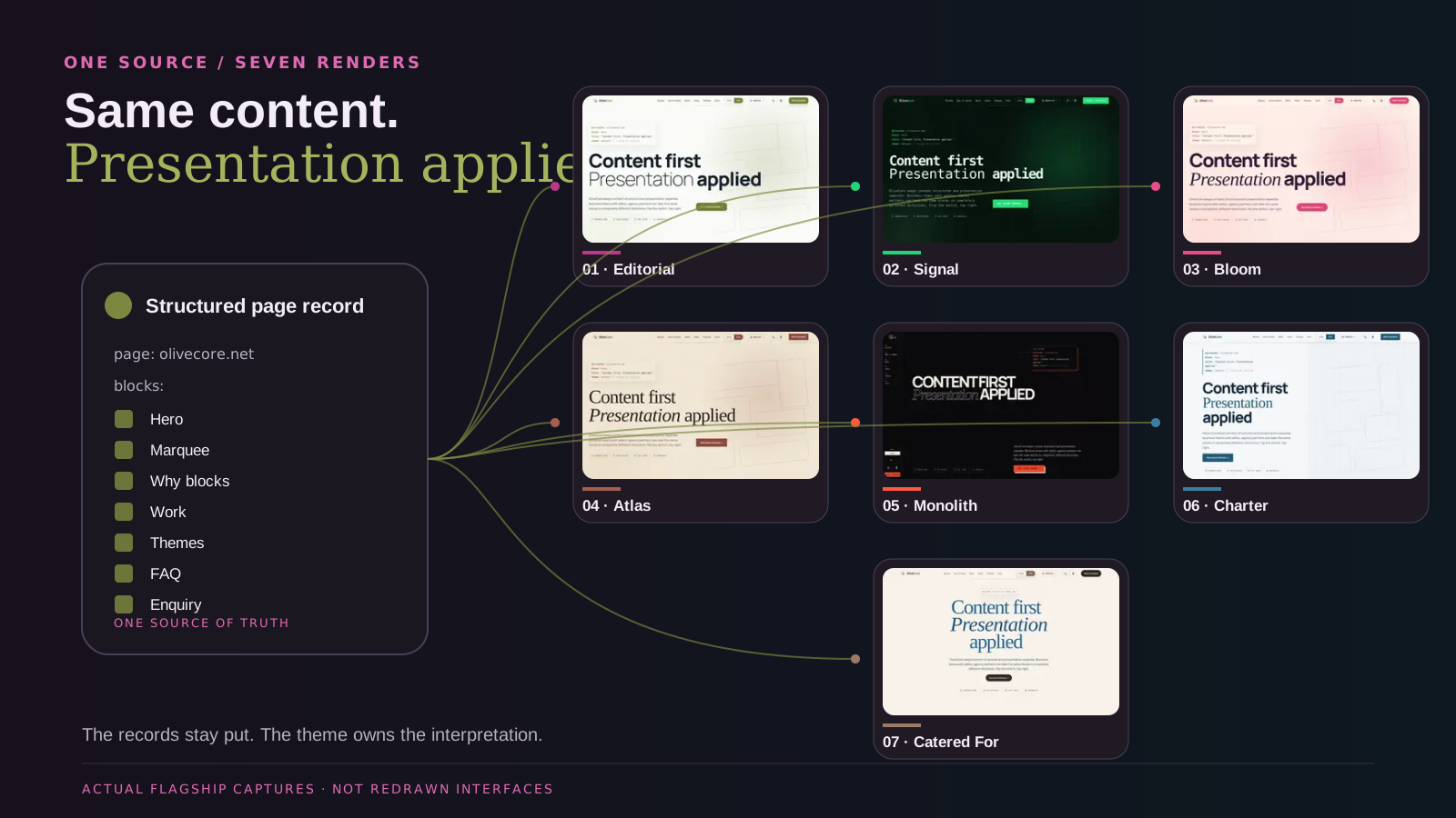
(03) Seven themes, not seven skins
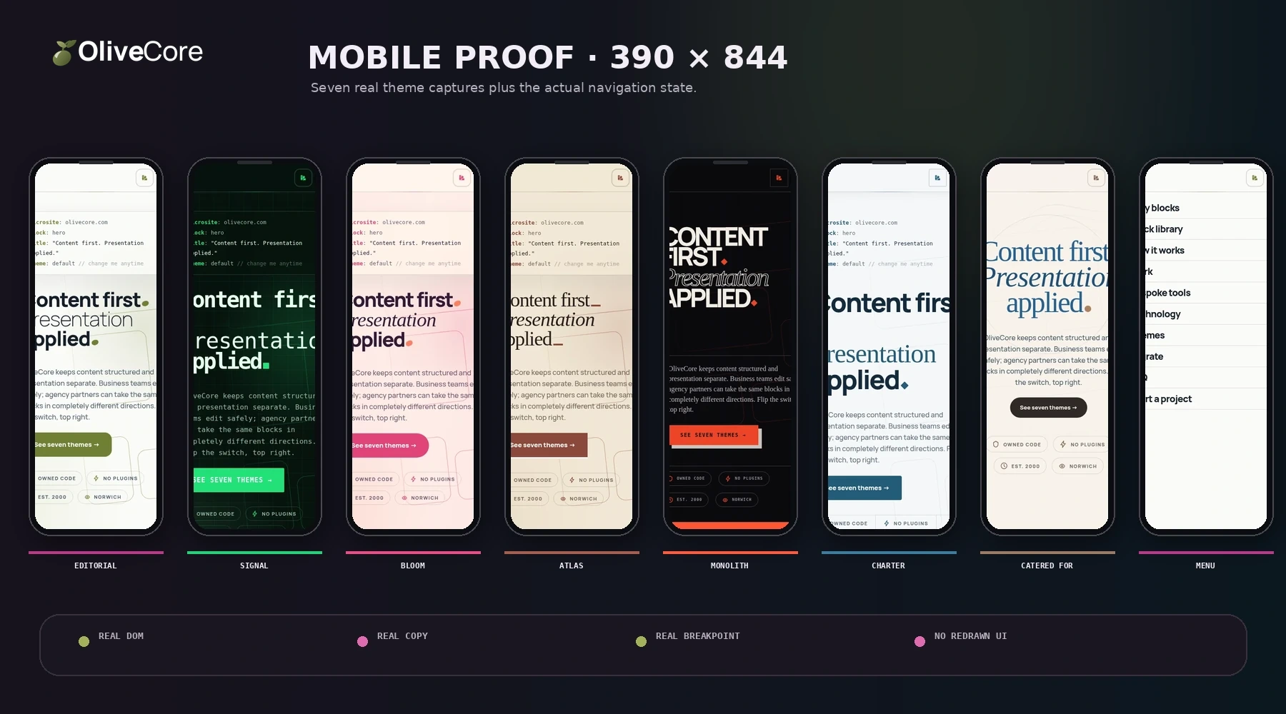
Editorial, Signal, Bloom, Atlas, Monolith, Charter and Catered For all render the same flagship content. The differences reach into navigation, page architecture, type, movement, cards, testimonials, forms and mobile behaviour.
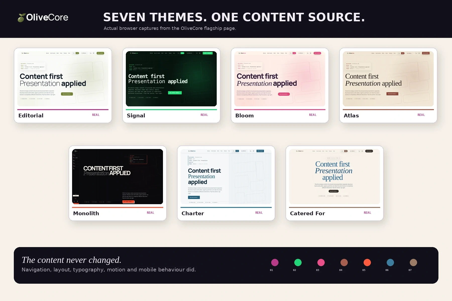
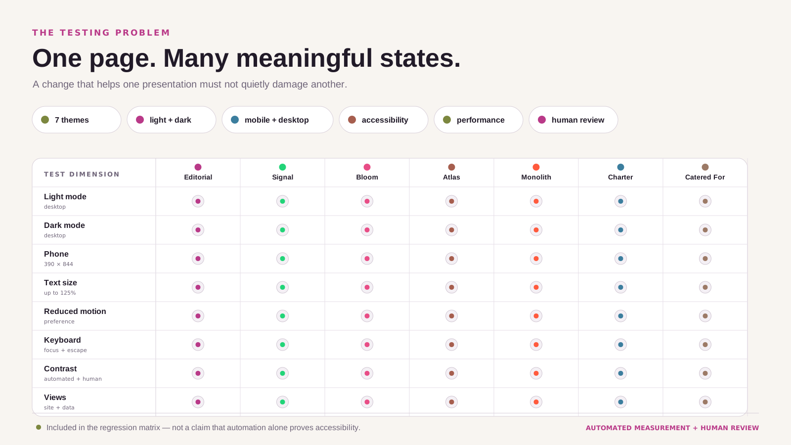
(04) The complexity multiplies
A page can look perfect in Editorial on a desktop and fail in Catered For at 125% text on a narrow phone. Once light and dark, three text sizes, contrast, reduced motion, site and data views and multiple viewport shapes are added, visual confidence cannot come from checking the default screen.
(05) So we built the tester
Lighthouse can inspect one presentation at one moment. We needed to drive the real page through its own themes, modes, text sizes, motion preferences and viewports — then compare the next build with a frozen baseline.
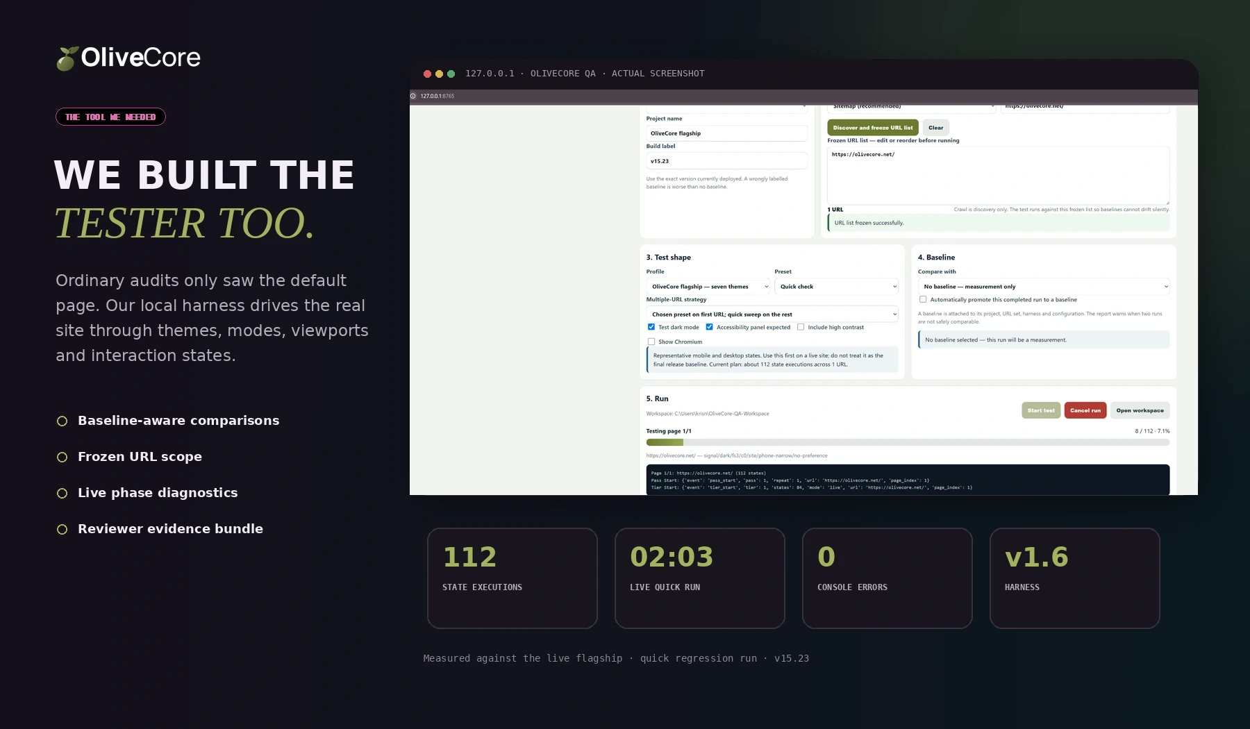
The tool launches Chromium, switches the page into known states, traverses the content, opens real controls, checks layout and interaction, measures colour pairs, records intermittent behaviour and exports the evidence for another reviewer.
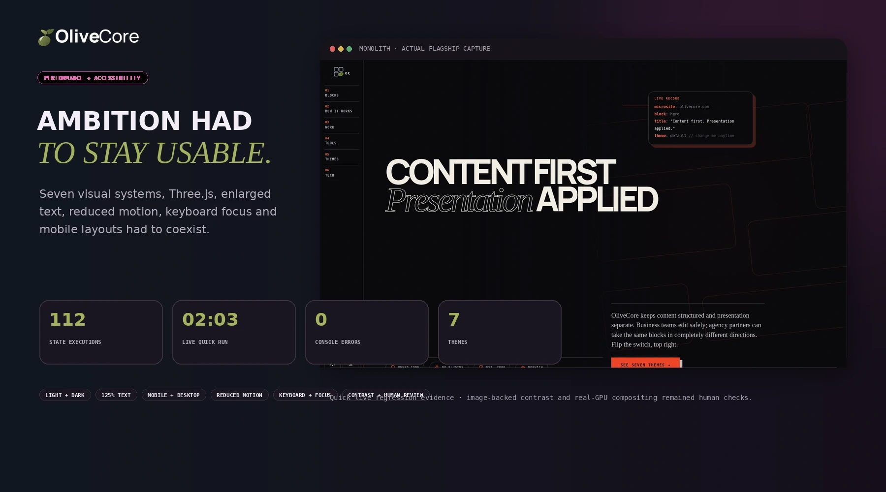
The first accepted live quick run exercised 112 states in about two minutes and completed with no console errors. That is operational evidence, not a claim that one automated run proves the site perfect.
(06) Review that creates useful friction
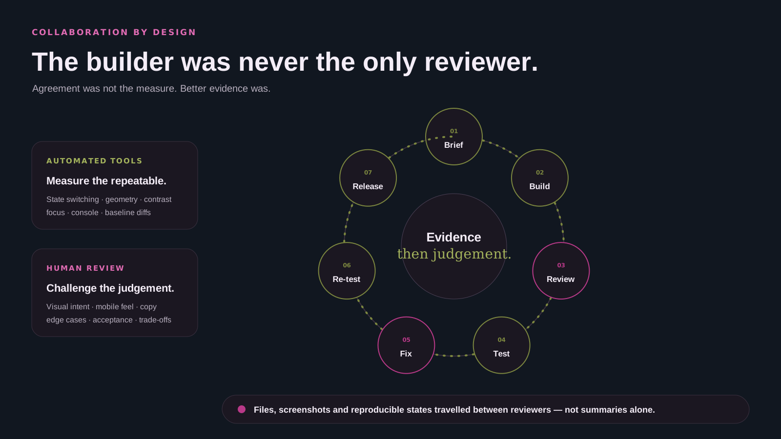
Build and review were deliberately separated. Automated tools measured repeatable things; human reviewers challenged visual intent, language, mobile composition, edge cases and the assumptions inside the tester itself.
The useful moments were not the easy agreements. They were the findings that changed a mapping rule, exposed a false positive, found a dead test, or showed that a correction in one presentation had damaged another.
Files, screenshots and reproducible states travelled between reviewers — not flattering summaries.
(07) Performance and accessibility together
Seven visual systems, Three.js scenes, enlarged typography and layered motion would mean very little if the page became heavy, disorientating or impossible to operate.
(08) Mobile was not a final check
The themes could not all collapse into the same generic stack. Navigation, type scale, content order, panels and the interaction model were checked at real narrow states, including enlarged text and the live mobile menu.
(09) What the exercise changed
The exercise demonstrated that a theme can change page architecture and behaviour, not merely palette and decoration.
Mobile, enlarged-text and component edge cases fed directly back into shared theme and rendering rules.
The baseline-and-diff workflow now exists for future OliveCore sites rather than remaining a one-off manual sweep.
Accessibility, performance and regression decisions can travel as reports, screenshots and exact states instead of promises.
(10) The live result
olivecore.net is the public result: a working flagship built against OliveCore's own block model and theme architecture, running one content source through seven presentations rather than showing seven disconnected mock-ups.
It is deliberately more demanding than an ordinary brochure site. That is the point: the exercise gives clients and agency partners something concrete to challenge, compare and inspect.
Visit olivecore.net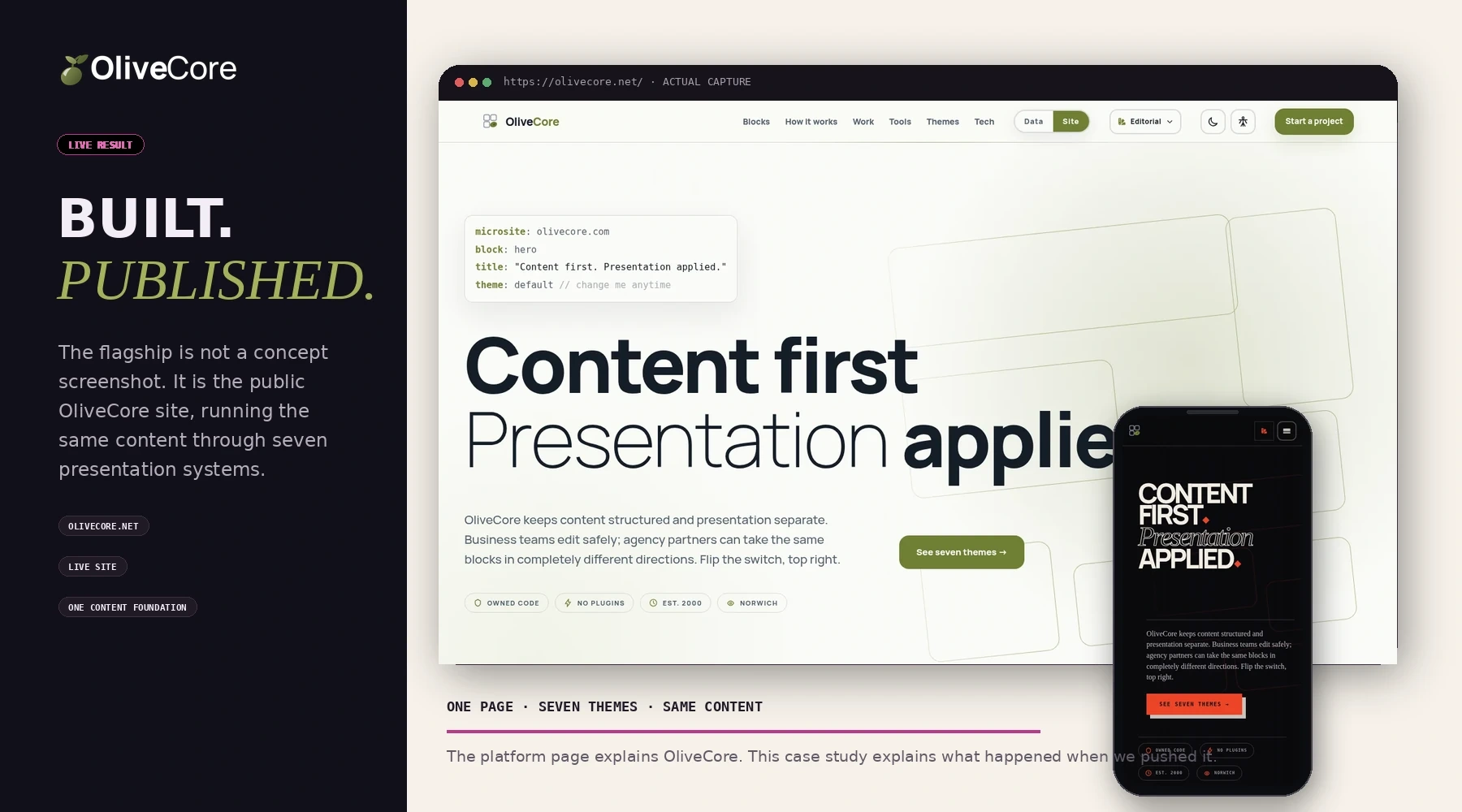
Flexibility is easy to claim when nobody tests the edges. We built seven different websites from one content source, then built the machinery needed to show that one theme's freedom had not become another theme's defect.